Unity User Interface (UI): "Unity UI is a UI toolkit for developing user interfaces for games and applications. It is a GameObject-based UI system that uses Components and the Game View to arrange, position, and style user interfaces.
This documentation describes Unity UI features such as creating a Canvas, positioning and animating elements, defining user interactions, and sizing layouts automatically."
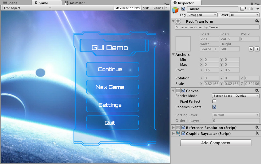
Example Canvas UI.
Canvas: "The Canvas is the area that all UI elements should be inside. The Canvas is a Game Object with a Canvas component on it, and all UI elements must be children of such a Canvas.
Creating a new UI element, such as an Image using the menu GameObject > UI > Image, automatically creates a Canvas, if there isn't already a Canvas in the scene. The UI element is created as a child to this Canvas.
The Canvas area is shown as a rectangle in the Scene View. This makes it easy to position UI elements without needing to have the Game View visible at all times.
Canvas uses the EventSystem object to help the Messaging System."
Main Visual Components:
Text: "The Text component, which is also known as a Label, has a Text area for entering the text that will be displayed. It is possible to set the font, font style, font size and whether or not the text has rich text capability."
Image: "An Image has a Rect Transform component and an Image component. A sprite can be applied to the Image component under the Target Graphic field, and its color can be set in the Color field. A material can also be applied to the Image component."
Main Interaction Components:
Button: "The Button control responds to a click from the user and is used to initiate or confirm an action. Familiar examples include the Submit and Cancel buttons used on web forms."
Slider: "The Slider control allows the user to select a numeric value from a predetermined range by dragging the mouse. Note that the similar ScrollBar control is used for scrolling rather than selecting numeric values. Familiar examples include difficulty settings in games and brightness settings in image editors."
Scrollbar: "The Scrollbar control allows the user to scroll an image or other view that is too large to see completely. Note that the similar Slider control is used for selecting numeric values rather than scrolling. Familiar examples include the vertical Scrollbar at the side of a text editor and the vertical and horizontal pair of bars for viewing a section of a large image or map."
Dropdown: "The Dropdown can be used to let the user choose a single option from a list of options.
The control shows the currently chosen option. Once clicked, it opens up the list of options so a new option can be chosen. Upon choosing a new option, the list of closed again, and the control shows the new selected option. The list is also closed if the user clicks on the control itself, or anywhere else inside the Canvas."
Input Field: "An Input Field is a way to make the text of a Text Control editable. Like the other interaction controls, it's not a visible UI element in itself and must be combined with one or more visual UI elements in order to be visible."
Recommended Tutorials:
Creating a World Space UI: https://docs.unity3d.com/Packages/com.unity.ugui@1.0/manual/HOWTO-UIWorldSpace.html
Start Menu in Unity: https://www.youtube.com/watch?v=zc8ac_qUXQY
Settings Menu in Unity: https://www.youtube.com/watch?v=YOaYQrN1oYQ
Pause Menu in Unity: https://www.youtube.com/watch?v=JivuXdrIHK0
How to Make UI in Unity: youtube.com/watch?v=_RIsfVOqTaE
Make a Gorgeous Start Menu (Unity UI Tutorial): https://www.youtube.com/watch?v=vqZjZ6yv1lA